Cryptocurrency Technical Analysis Guide
Introduction to Cryptocurrency Technical Analysis
“Here’s your guide to cryptocurrency technical analysis.”
Welcome to the world of cryptocurrency technical analysis. This guide is designed to provide you with a comprehensive understanding of how to analyze crypto charts effectively.
Overview of Cryptocurrency Technical Analysis
Cryptocurrency technical analysis involves evaluating statistical trends gathered from trading activity, such as price movement and volume. By analyzing these trends, traders can make informed decisions about buying and selling cryptocurrencies.
Importance of Analyzing Crypto Charts
Analyzing crypto charts is crucial for traders who want to understand market behavior and predict future price movements. It helps in identifying patterns and trends that are not immediately obvious, providing a strategic advantage in trading.
Objective of the Guide
This guide aims to equip you with the necessary tools and knowledge to perform technical analysis on cryptocurrency markets. Whether you are a beginner or an experienced trader, understanding these concepts will enhance your trading strategies.
Continue your learning journey with the next section on Understanding Candlestick Charts.
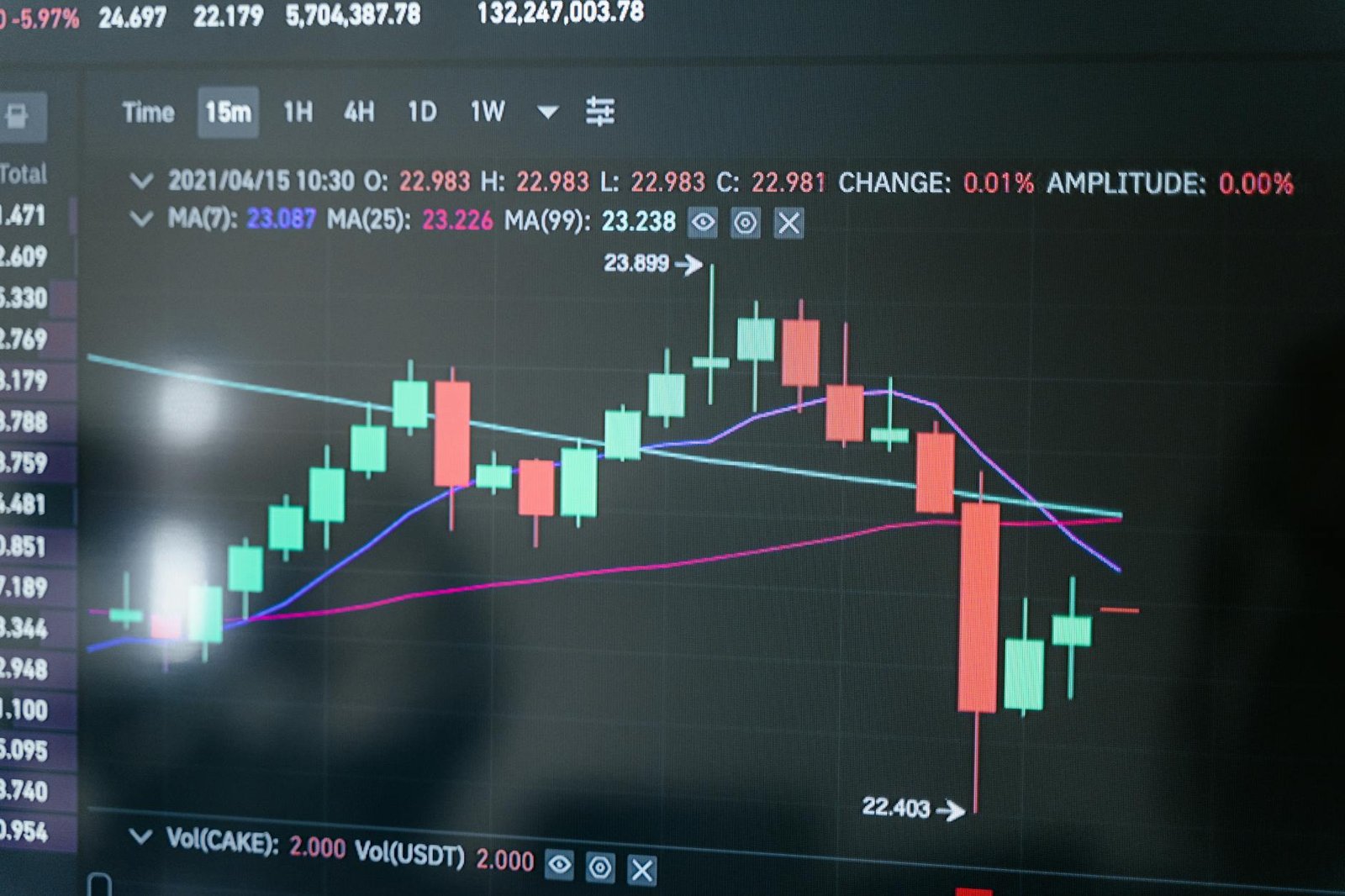
Understanding Candlestick Charts
Candlestick charts are a fundamental tool in technical analysis, especially in cryptocurrency trading. They provide a visual representation of price movements over a specific period. In this module, we will explore the components of candlestick charts and their significance in trading.
What are Candlesticks?
Candlesticks are graphical representations of price movements in a given time frame. Each candlestick shows four key pieces of information: the opening price, closing price, highest price, and lowest price during that period.
“These are candlesticks. So I’m gonna go through what these actually mean.”
Components of a Candlestick
- Body: The colored part of the candlestick, which represents the range between the opening and closing prices. A green body indicates that the closing price was higher than the opening price, while a red body indicates the opposite.
- Wick (or Shadow): The lines extending above and below the body, representing the highest and lowest prices during the period.
Significance of Red and Green Candles
- Green Candle: Indicates a bullish market where the closing price is higher than the opening price.
- Red Candle: Indicates a bearish market where the closing price is lower than the opening price.
Understanding these components helps traders make informed decisions by analyzing market trends and price movements. By interpreting candlestick patterns, traders can predict potential market reversals or continuations.
For further exploration of candlestick patterns, proceed to the next module: Reading Candlestick Patterns.
Reading Candlestick Patterns
Candlestick charts are a fundamental tool in cryptocurrency technical analysis, providing insights into market trends and price movements. Each candlestick on the chart represents a specific period, such as a day or four hours, and conveys essential information about the trading activity during that time.
Understanding Candlestick Colors
Candlesticks are typically color-coded to indicate price movements:
- Green Candlesticks: These indicate that the price has increased during the time period. A green candlestick means the closing price was higher than the opening price.
- Red Candlesticks: These show that the price has decreased. A red candlestick means the closing price was lower than the opening price.
“Red for down and green for up.”
Time Frames
The time frame of each candlestick can be adjusted to suit different analysis needs. For instance, a one-day candlestick represents 24 hours of trading, while a four-hour candlestick shows a shorter period. This flexibility allows traders to zoom in or out on market trends.
Analyzing Candlestick Patterns
Candlestick patterns can reveal market sentiment and potential future movements. Recognizing patterns such as bullish and bearish trends is crucial for making informed trading decisions.
Bullish and Bearish Candles
- Bullish Candles: Indicate a potential upward trend. These are often green and suggest that buyers are in control.
- Bearish Candles: Indicate a potential downward trend. These are often red and suggest that sellers are dominating.
Identifying Bullish Engulfing Patterns
A bullish engulfing pattern occurs when a small red candlestick is followed by a larger green candlestick, indicating a potential reversal from a downtrend to an uptrend.
Understanding these patterns and their implications can significantly enhance your trading strategy. For more foundational knowledge, refer to Understanding Candlestick Charts.
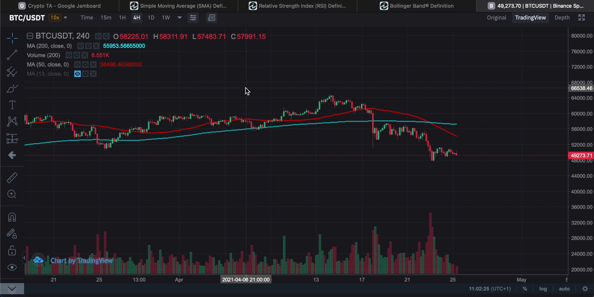
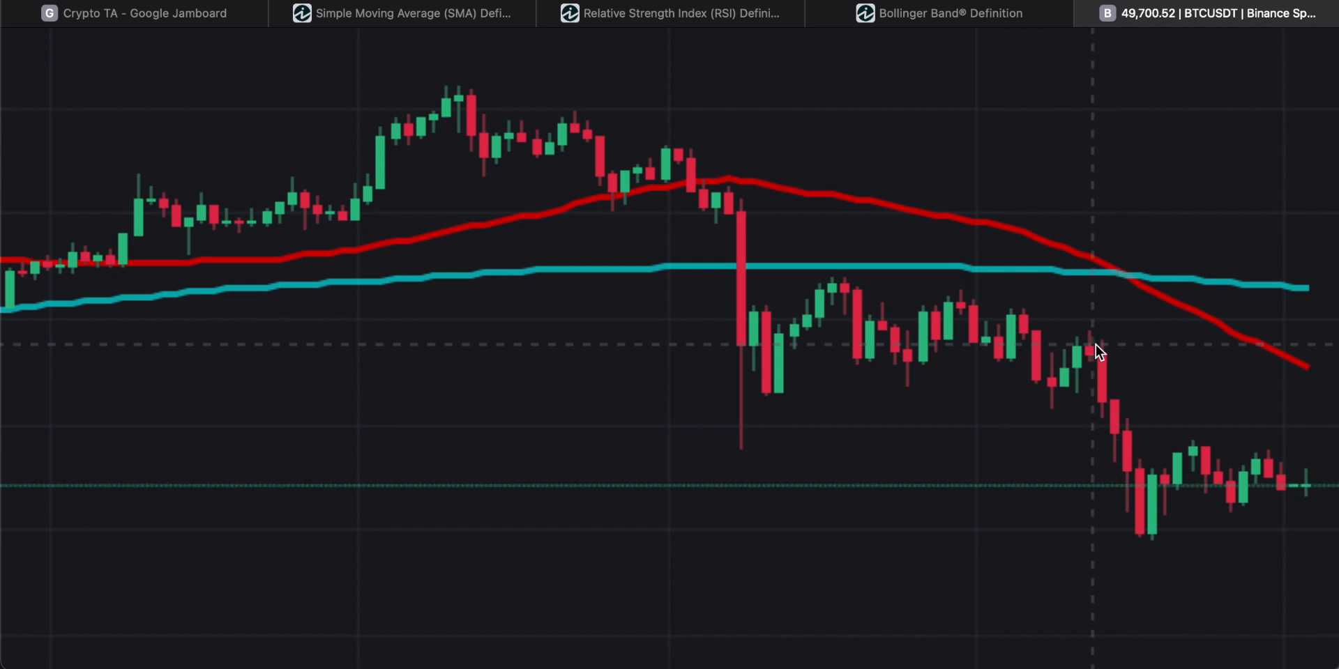
Trend Lines and Their Importance
Definition of Trend Lines
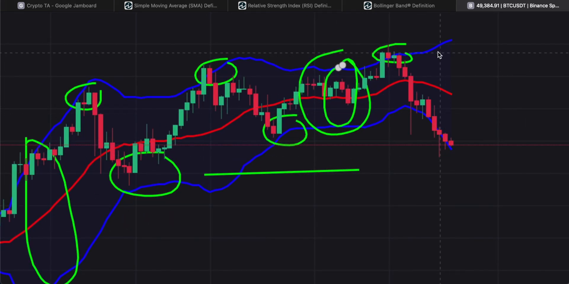
A trend line is a straightforward tool used in technical analysis to represent the direction of a market trend. It is drawn by connecting two or more price points on a chart, typically using swing pivots. This helps traders visualize the trend and make informed decisions.
“A trend line is a very simple way of drawing a trend on the system.”
How to Draw Trend Lines
To draw a trend line, you need to connect areas of consolidation that confirm the trend. This involves linking swing pivots, which are points where the price changes direction. It’s important to note that trend lines are not perfect and may not always align perfectly with price movements.
- Identify Swing Pivots: Look for points where the price changes direction.
- Connect the Dots: Draw a line connecting these points to form a trend line.
- Adjust for Accuracy: Ensure the line reflects the general direction of the trend, even if it cuts through some price movements.
Importance of Trend Lines in Trading
Trend lines are crucial for traders as they provide a visual representation of the market’s direction. They help in identifying potential entry and exit points and can be used alongside other technical indicators to enhance trading strategies.
- Visual Aid: Simplifies the understanding of market trends.
- Decision Making: Assists in determining when to enter or exit trades.
- Complementary Tool: Works well with other indicators like moving averages and candlestick patterns.
For more on technical analysis, explore our other modules:
- Introduction to Cryptocurrency Technical Analysis
- Understanding Candlestick Charts
- Reading Candlestick Patterns
- Support and Resistance Levels
- Chart Patterns: Head and Shoulders
- Using Indicators: RSI and Bollinger Bands
- Limitations of Technical Analysis
- Conclusion and Further Resources
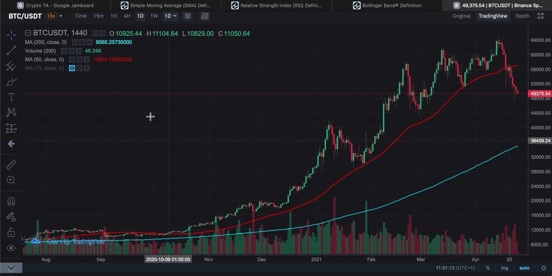
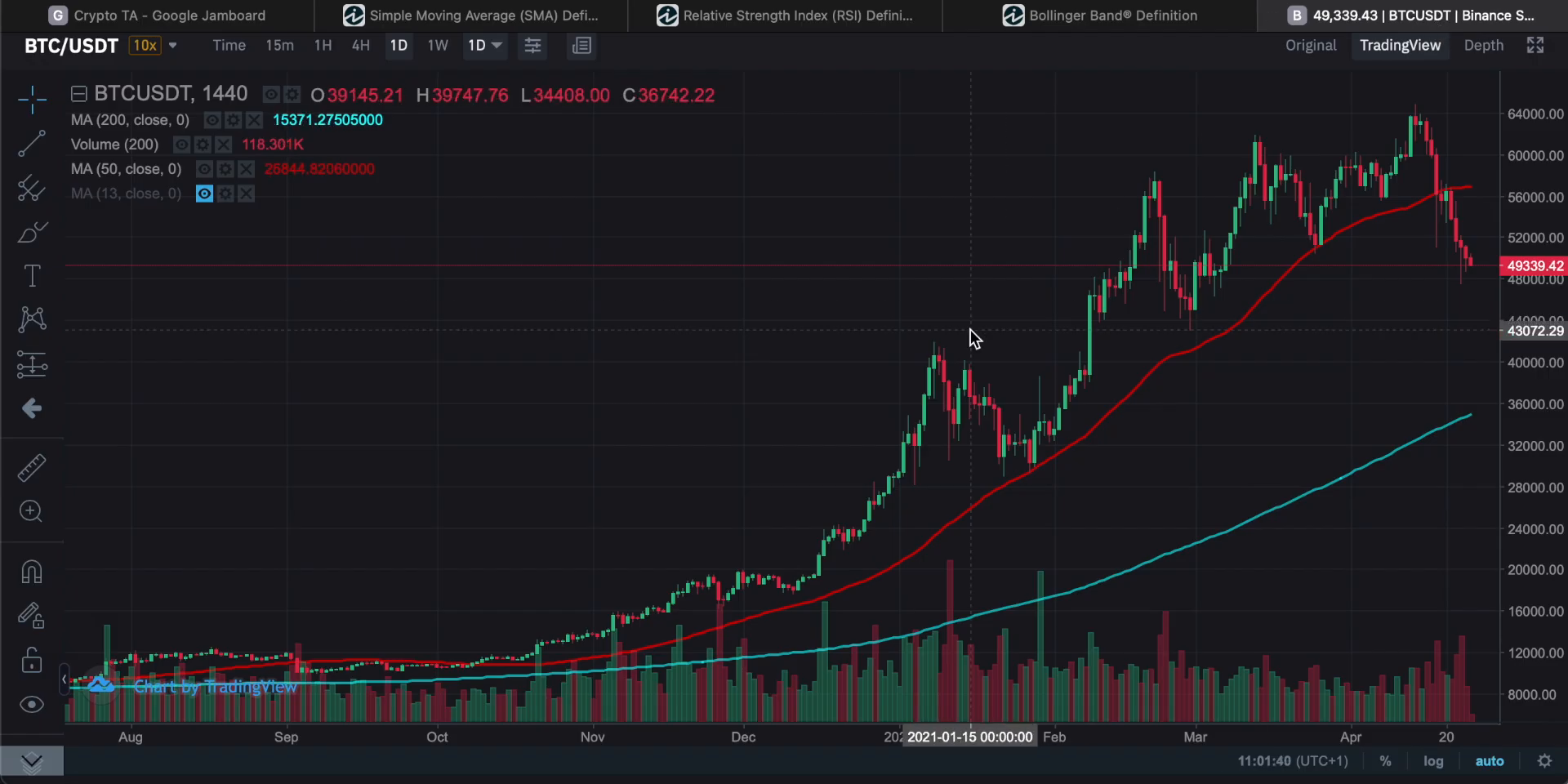
Support and Resistance Levels
Support and resistance are fundamental concepts in technical analysis, crucial for understanding market dynamics and making informed trading decisions.
What are Support and Resistance?
Support is a price level where a downtrend can be expected to pause due to a concentration of demand. As prices fall, traders look for a point where the price might stop falling and potentially bounce back.
“Support is when prices fall, and you wanna find somewhere where the price falls and then possibly bounces back off that.”
Resistance, on the other hand, is the opposite. It is a price level where an uptrend can be expected to pause due to a concentration of selling interest. As prices rise, traders look for a point where the price might stop rising and potentially reverse.
Identifying Support and Resistance Levels
To identify these levels, traders often draw horizontal lines on charts to mark areas where the price has repeatedly bounced off or reversed. These lines are not always precise but represent zones where the price action is significant.
- Support Levels: Look for areas where the price has repeatedly stopped falling and bounced back.
- Resistance Levels: Identify areas where the price has repeatedly stopped rising and reversed.
In the provided chart, resistance lines are drawn at points where upward movements have ended, indicating potential reversal zones.
Importance in Trading
Understanding support and resistance levels helps traders make decisions about entry and exit points. These levels can signal potential reversals or continuations in price trends, providing opportunities for strategic trades.
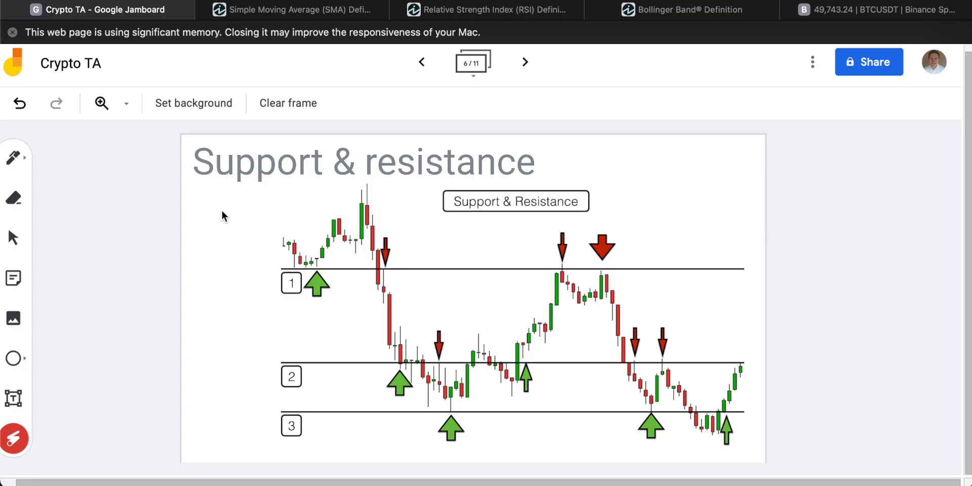
By identifying the largest areas of trade on a chart, traders can better predict where support and resistance might occur, aiding in the development of effective trading strategies.
For further exploration of technical analysis concepts, you can visit the Trend Lines and Their Importance page.
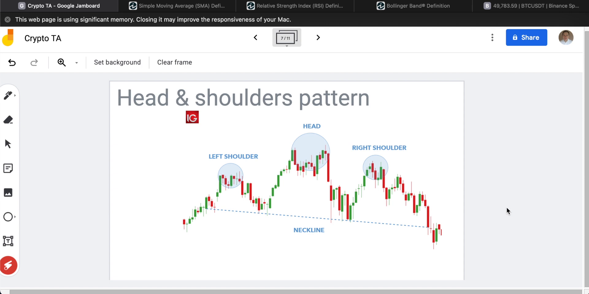
Chart Patterns: Head and Shoulders
The head and shoulders pattern is a classic chart pattern used in technical analysis to predict potential price movements. This pattern is characterized by three peaks: a higher peak (the head) between two lower peaks (the shoulders). Understanding this pattern can provide valuable insights for traders.
“This is a classic chart pattern called a head and shoulders pattern.”
Overview of Head and Shoulders Pattern
The head and shoulders pattern is typically seen as a reversal pattern, indicating a change in trend direction. It consists of three main components:
- Left Shoulder: This is formed after a period of consolidation and resistance at a certain level, followed by a slight decline.
- Head: The price rises again to form a higher peak than the left shoulder, followed by another decline.
- Right Shoulder: The price rises once more but fails to reach the height of the head, indicating a potential bearish reversal.
How to Identify This Pattern
- Left Shoulder: Look for a peak followed by a decline.
- Head: Identify a higher peak than the left shoulder, followed by another decline.
- Right Shoulder: Spot a peak lower than the head, indicating resistance and a potential reversal.
- Neckline: Draw a line connecting the lowest points of the two troughs. A break below this line confirms the pattern.
Implications of the Pattern for Traders
The head and shoulders pattern is often seen as a bearish signal, suggesting that sellers are gaining control over buyers. When the right shoulder forms at a lower high than the head, it indicates that sellers are successfully pushing the price down, preventing it from reaching previous highs.
Traders often look for a break below the neckline to confirm the pattern and may consider this a signal to enter a short position.
For more insights on technical analysis, explore our other modules:
- Introduction to Cryptocurrency Technical Analysis
- Understanding Candlestick Charts
- Reading Candlestick Patterns
- Trend Lines and Their Importance
- Support and Resistance Levels
- Using Indicators: RSI and Bollinger Bands
- Limitations of Technical Analysis
- Conclusion and Further Resources
Using Indicators: RSI and Bollinger Bands
In this module, we will explore two essential indicators used in cryptocurrency technical analysis: the Relative Strength Index (RSI) and Bollinger Bands. These tools help traders make informed decisions by analyzing market trends and price movements.
Relative Strength Index (RSI)
The RSI is a momentum indicator that measures the speed and change of price movements. It is typically used to identify overbought or oversold conditions in a market. The RSI is displayed as an oscillator and can have a reading from 0 to 100. A reading above 70 is generally considered overbought, while a reading below 30 is considered oversold.
“The RSI is a momentum indicator.”
Significance of RSI
- Overbought and Oversold Levels: Helps identify potential reversal points.
- Divergence: Indicates potential reversals when the price moves in the opposite direction of the RSI.
- Trend Identification: Confirms trends when used in conjunction with other indicators.
Bollinger Bands
Bollinger Bands consist of a middle band (a simple moving average) and two outer bands (standard deviations away from the middle band). They are used to measure market volatility and identify overbought or oversold conditions.
How to Use Bollinger Bands
- Volatility Measurement: Bands widen during volatile periods and contract during less volatile periods.
- Price Reversals: Prices often bounce within the bands, and touching the outer bands can indicate a reversal.
- Trend Continuation: A strong trend is often indicated when prices move along the outer band.
Using RSI and Bollinger Bands in Trading
Traders often use RSI and Bollinger Bands together to confirm signals and make more accurate trading decisions. For example, if the RSI indicates an overbought condition and the price touches the upper Bollinger Band, it may signal a potential sell opportunity.
For more foundational concepts, you can refer to our previous modules on Introduction to Cryptocurrency Technical Analysis and Understanding Candlestick Charts.
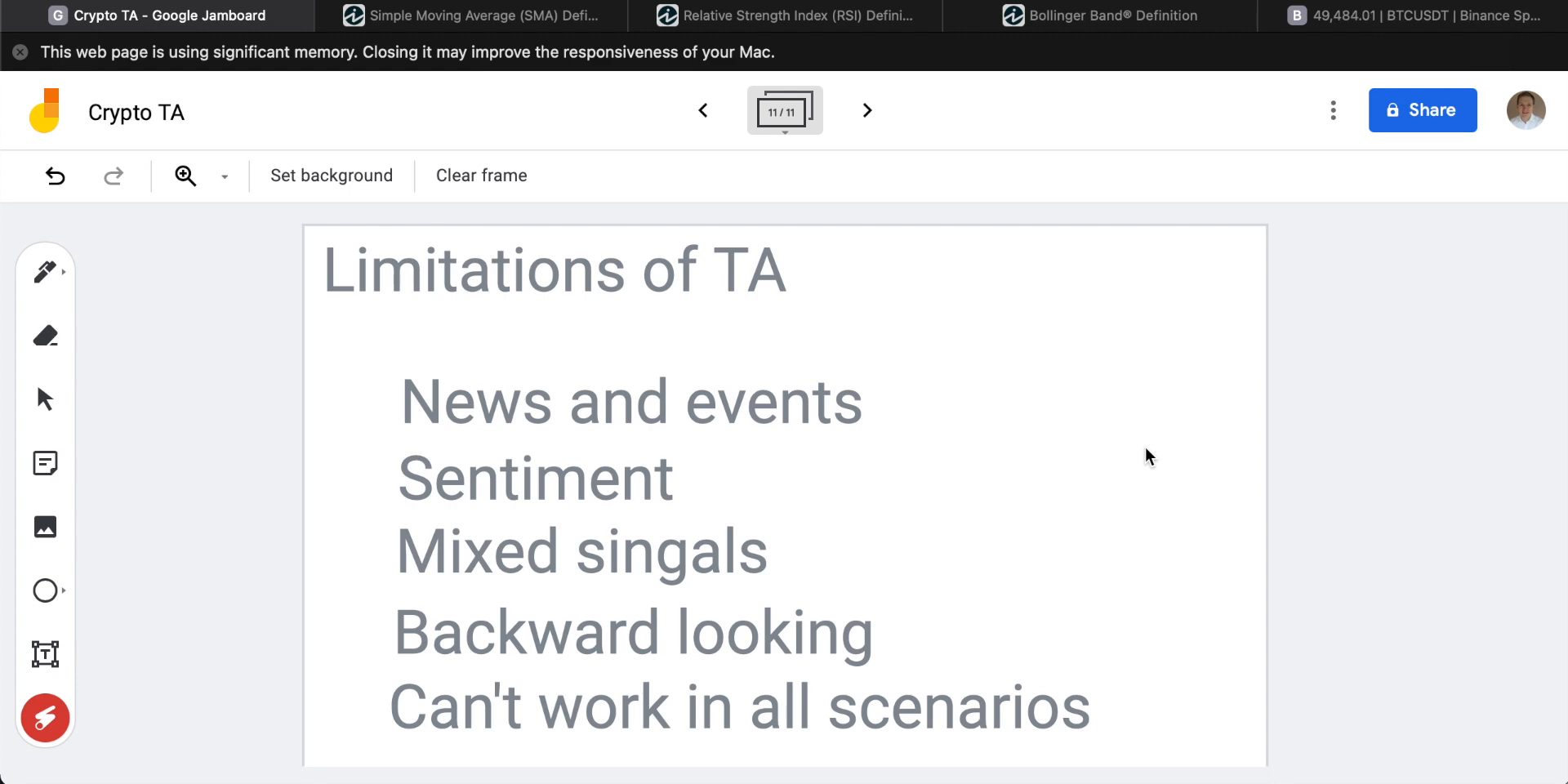
Limitations of Technical Analysis
Technical analysis (TA) is a popular method used by traders to evaluate and predict market trends based on historical price movements and patterns. However, it has several limitations that traders should be aware of.
Backward-Looking Nature
Technical analysis is inherently backward-looking. It relies on past price data to identify patterns and trends, which means it cannot predict future market movements. This limitation is evident in tools like Bollinger Bands, which expand and contract based on past volatility but cannot indicate the direction of future breakouts.
“TA completely disregards news and events.”
Ignoring News and Events
One of the significant drawbacks of technical analysis is its disregard for macroeconomic news and events. Factors such as economic reports, employment figures, national debt, and GDP can significantly impact market movements. Technical analysis does not account for these elements, making it less effective in predicting market changes driven by news.
Mixed Signals
Traders often encounter mixed signals when using multiple technical indicators. For instance, a high Relative Strength Index (RSI) might suggest an overbought condition, but it doesn’t necessarily mean the price won’t continue to rise. The more indicators used, the more potential for confusion, as they may provide conflicting information.
Importance of Fundamental Analysis
Given these limitations, incorporating fundamental analysis is crucial. Understanding market fundamentals, future policy decisions, and economic growth is essential, especially in the context of cryptocurrency projects. Fundamental analysis provides insights that technical analysis cannot, offering a more comprehensive view of market dynamics.
For further learning, explore our Introduction to Cryptocurrency Technical Analysis and other related modules in the course.
Conclusion and Further Resources
As we conclude our exploration of cryptocurrency technical analysis, it’s essential to reflect on the key insights and tools we’ve covered. From understanding the basics of candlestick charts and reading candlestick patterns to the importance of trend lines and support and resistance levels, each element plays a crucial role in analyzing market trends.
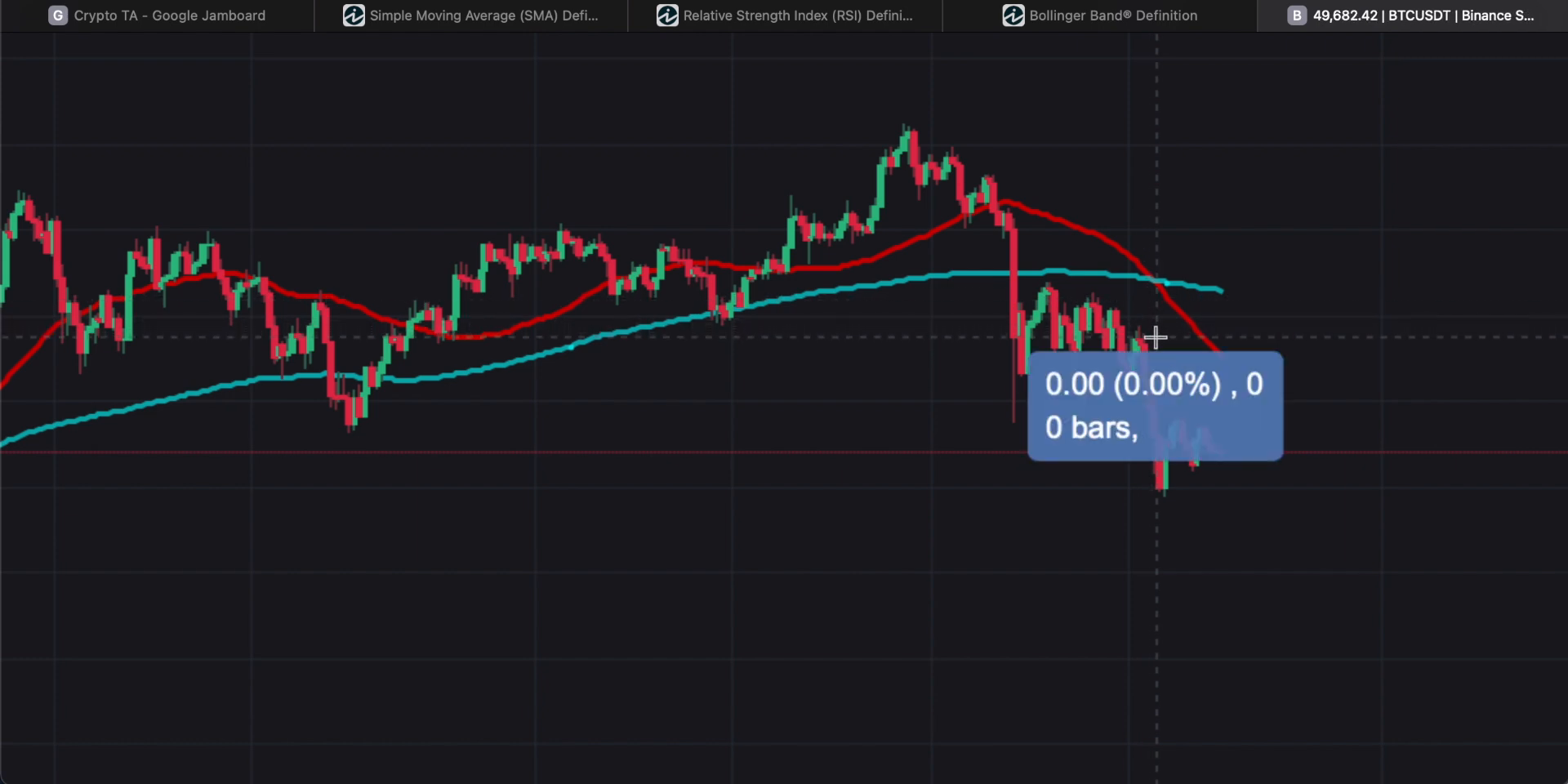
We also delved into specific chart patterns like the Head and Shoulders and explored indicators such as the RSI and Bollinger Bands. While these tools are invaluable, it’s important to acknowledge the limitations of technical analysis, such as its backward-looking nature and susceptibility to news and events, as highlighted in the screenshot below.
For those eager to deepen their understanding, numerous resources are available to expand your knowledge and skills in technical analysis. Engaging with these materials can provide a more comprehensive view and enhance your trading strategies.
“Make sure to subscribe for daily helpful crypto content.”
We encourage you to subscribe and follow for more insightful content that can aid in your cryptocurrency journey. Thank you for joining us, and we look forward to seeing you in future discussions.